Charlotte's Column: A New Logo and A New Chapter for Charlotte Travel
Charlotte Travel was founded by Jackie and Roger Harris, my parents, about two decades ago. With the company named after me, and with my inherent passion for travel, I happily joined my parents in running Charlotte Travel in 2014. Charlotte Travel has prided itself on its service excellence since its establishment in 2001, and I joined with a vision to further develop the company into a leading travel agency with global recognition in the luxury travel market, by sharpening our professionalism, enhancing our personalised service standards, and broadening our prestigious supplier network.
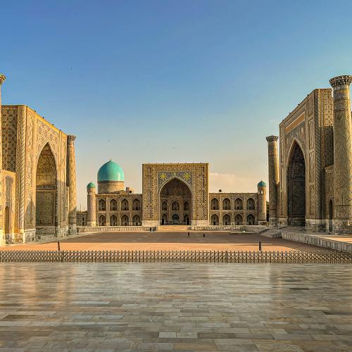
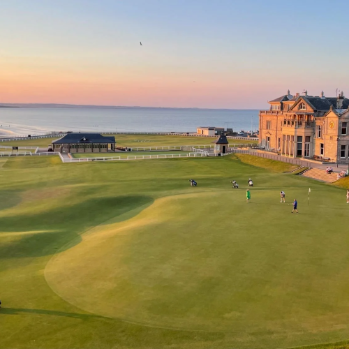
As we approach our 20th Anniversary this year, we are paving the way for a huge celebration, and developing a new logo, a symbol filled with meaning and with global appeal, is one of the key steps in Charlotte Travel's brand evolution. We want to maintain a genuine connection with our customers by creating a lasting emotional experience between the brand and our clients, who love exploring the world in style while enjoying every touch point of our service. The goal is to build a logo that speaks to our esteemed customers and our mutual passion for travel.
Our existing logo has represented a longstanding reputable company that is home to happy staff servicing our happy customers for 19 years. The logo was developed for its resemblance of my smiling face as a happy child, and to convey the feeling my mother felt raising me whilst travelling, a feeling she hoped she could share with her clients. Now, both Charlotte and Charlotte Travel have grown and matured, each with interesting characters and strengths, and are ready to face a new generation of travellers with sophisticated expectations. I believe the time is apt for adopting a new logo which can inject more personality and emotional resonance into our brand identity.
For the first time in print, I am excited to unveil our new logo and share with you a glimpse of our fresh new look through my own perspective.
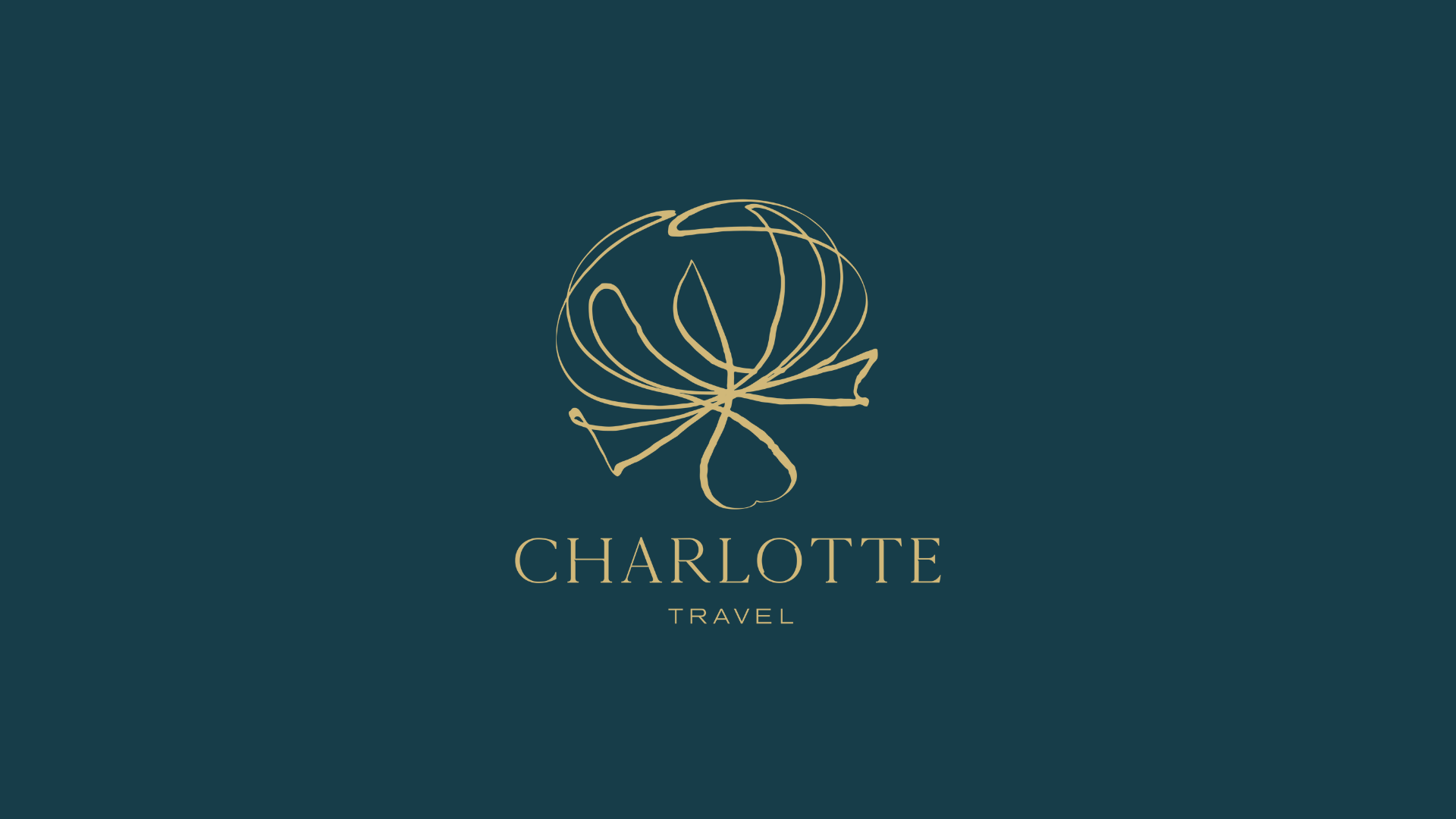
![]()
* The flower, a dandelion, is blooming, full of hope and positivity, full of beauty and elelgance, and full of life and possibilities.
* The cradle shape of the dandelion symbolises mother nature, echoing the passage of Charlotte Travel from my mother to me. Together, we now cradle a reputable and reliable family business. Afterall, the strong family bond is the foundation of Charlotte Travel's success.
*The hand drawn dandelion gives a personal touch, representing the personalization and attention to detail that we offer every customer.
*The petals of the dandelion could also be visualised as a network of global flight paths leading to the many destinations, extraordinary experiences, and treasured memories we offer our clients.
* The typeface for the word "Charlotte" is simple yet presented with sophisticated detail to convey elegance. "Simplicity is the ultimate sophistication." Leonardo Da Vinci.
Our new brand identity is elevated by richness in character, which extends easily from small, unique beauty to global diversity. I hope our new logo is already speaking to you before its official launch, and that you will like it as much as I do.